UI Reference
Every control in the Serpentine graph viewer, documented.
This page documents every control, setting, and keyboard shortcut in the Serpentine web interface. See UI Overview for a map of the five zones.
Header
The header sits at the top of every page. It contains:
- Logo — links back to the Serpentine homepage.
- VCS compare toolbar (center) — visible when running inside a git repository with the
[git]extra installed. See VCS compare toolbar below. - Settings button (user avatar icon, top right) — opens the settings dropdown.
VCS compare toolbar
The compare toolbar appears when serpentine serve detects a git repository and the [git] optional extra is installed. It lets you compare any two refs and overlay structural changes on the graph.
compare [base ref] ← [compare ref]The ← arrow reads “compare ref compared against base ref” — the same direction as a GitHub pull request.
Ref dropdowns
Each dropdown lists:
| Entry | Meaning |
|---|---|
| Current (live) | The graph as it currently exists on disk |
| At checkpoint | The snapshot saved with the Checkpoint button |
| Branches | All local git branches |
| Tags | All git tags |
| Recent commits | The last 100 commits on HEAD, shown as short hash + message |
Type in the search box inside each dropdown to filter. Full keyboard navigation is supported: ↓/↑ to move, Enter to select, Escape to close. Clicking outside also closes the dropdown.
Checkpoint button
The Checkpoint button (flag icon) marks the current live graph as the comparison baseline. This lets you track changes made during a session without committing to git. The checkpoint is held in server memory and cleared on server restart.
Change overlays
After selecting refs, every node in the graph is annotated:
| Color | Status | Meaning |
|---|---|---|
| Sky blue | Added | New in the compare ref |
| Amber | Modified | Exists in both refs but dependency surface changed |
| Red | Deleted | Existed in base, gone in compare (shown as ghost node) |
Unchanged nodes remain visible for structural context.
Persistence
The selected comparison is saved to localStorage. On page reload, Serpentine automatically replays the set_vcs_comparison action so overlays reappear without any action needed.
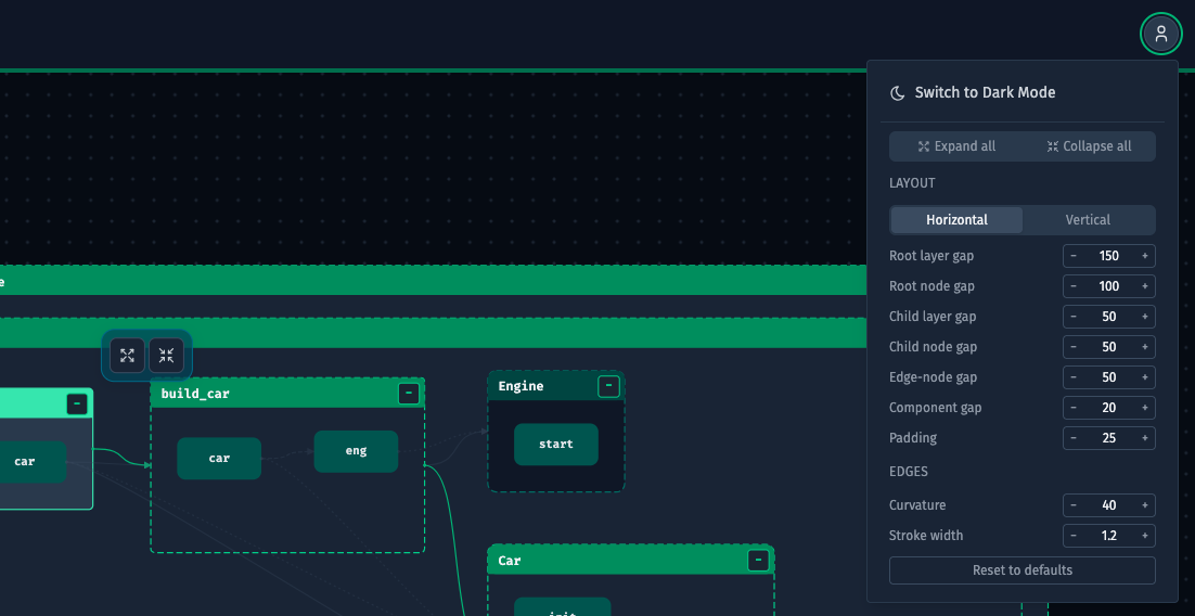
Settings dropdown
Expand all / Collapse all
Two buttons that apply to the entire graph at once. “Expand all” reveals every child node in every module and class. “Collapse all” hides all children so only top-level modules are visible. These same actions are available as icon buttons in the Object Explorer header.
Layout direction
A toggle with two options:
| Option | Behavior |
|---|---|
| Horizontal | Nodes are laid out left-to-right. Children appear to the right of their parent. |
| Vertical | Nodes are laid out top-to-bottom. Children appear below their parent. |
Keyboard shortcut: Ctrl+L (or ⌘L on Mac) — flips the direction without opening the dropdown.
Layout spacing
Seven numeric inputs with − / + steppers. All values are in pixels.
| Input | What it controls |
|---|---|
| Root layer gap | Space between hierarchy levels (depth layers) for root nodes |
| Root node gap | Space between sibling root nodes on the same level |
| Child layer gap | Space between hierarchy levels inside an expanded node |
| Child node gap | Space between sibling child nodes |
| Edge-node gap | Minimum distance between an edge and a nearby node it doesn’t connect |
| Component gap | Space between disconnected subgraphs that don’t share any edges |
| Padding | Empty space between the outermost nodes and the canvas boundary |
Edge settings
| Input | What it controls |
|---|---|
| Curvature | How strongly curved the bezier edges are. 0 = straight lines. |
| Stroke width | Thickness of the edge lines in pixels. |
Reset to defaults
Restores all layout spacing and edge settings to their original values. Does not affect layout direction or theme.
Theme
Three-way toggle: Light, Dark, and System (follows your OS preference).
Object Explorer
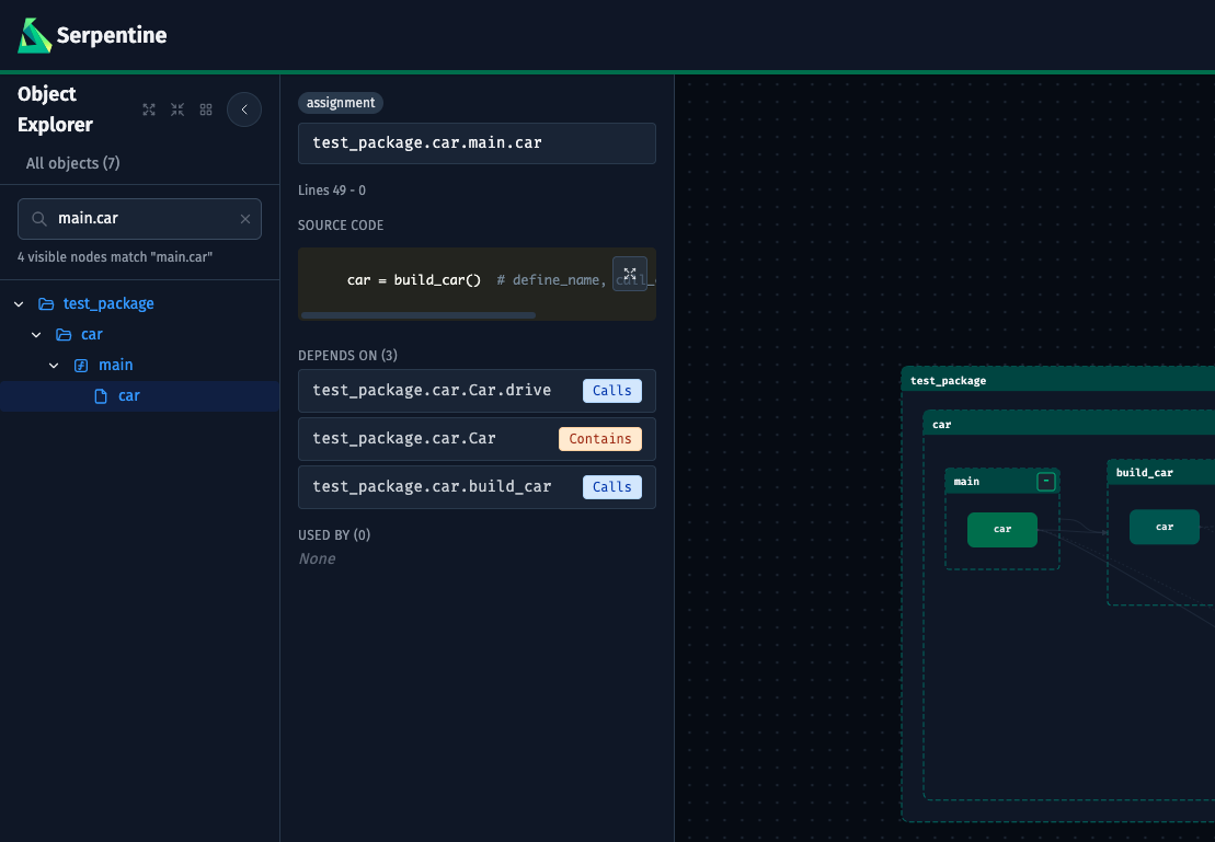
The Object Explorer is the tree-navigation sidebar on the left side of the canvas.
Collapse and resize
- Toggle button (circular button at the top-right of the sidebar) — collapses the sidebar to a thin 32px rail. Click again to restore it.
- Resize handle — drag the right edge of the sidebar to any width between 180px and 500px.
The tree
All nodes in the graph are listed in a hierarchical tree: modules at the top level, with classes and functions nested inside. Each node type has a distinct icon:
| Icon | Node type |
|---|---|
| Folder (open/closed) | Module with children |
| File | Module leaf (no children) |
{} | Class |
ƒ | Function |
Nodes imported from the standard library appear in gray. Nodes from third-party packages appear in green. Nodes defined in your own project appear in the default color.
Click any node to select it. The canvas pans and zooms to center it, and the Detail Panel opens.
Search
Press Ctrl+F (or ⌘F on Mac) or click the search input to filter the tree. The tree updates live as you type, showing only nodes whose name matches the query. A count of matching nodes appears below the input.
- Press
Escapeto clear the search and restore the full tree. - Click the
×button inside the input to clear it.
Expand and collapse
Three icon buttons appear in the sidebar header when the sidebar is not collapsed:
| Button | Action |
|---|---|
| Expand all | Opens every node in the tree |
| Collapse all | Closes every node in the tree |
| Reset layout | Re-runs the automatic layout algorithm on the graph |
Change indicators
Nodes are annotated with colored indicators in two cases: when files change on disk (file-watch mode) and when a VCS comparison is active.
| Color | Status | Meaning |
|---|---|---|
| Sky blue | Added | New node (not in the base ref / previous state) |
| Amber | Modified | Node exists in both states but changed |
| Red + strikethrough | Deleted | Node existed before but is now gone |
A Dismiss button appears on each changed node. In file-watch mode, a Clear changes button appears at the top of the tree to remove all indicators at once.
For VCS comparisons, change indicators reflect the structural diff between the selected refs — not file timestamps. See VCS Integration for details.
Graph Canvas
Navigation
| Action | Result |
|---|---|
| Drag the background | Pan the canvas |
| Scroll wheel | Zoom in or out, anchored to the cursor position |
Nodes
Each rectangle on the canvas represents a code object. Nodes are color-coded by type: modules are larger, classes are medium, functions are the smallest. A node that has been added, modified, or deleted since the last load shows a colored status badge.
Edges
Arrows between nodes represent references. The edge type is encoded in the color and the label on hover:
| Edge type | Meaning |
|---|---|
| calls | One function calls another |
| is-a | A class inherits from another |
| has-a | A constructor call (one object contains an instance of another) |
| references | A name reference (e.g. accessing a constant or type) |
| imports | A module-level import |
Selecting nodes
Click a node to select it. The selected node is highlighted and the Detail Panel opens on the right. Click the background to deselect.
Expand and collapse children
When a node with children is selected, a small toolbar appears above it with two icon buttons:
| Button | Action |
|---|---|
| Expand icon | Expands all children of this node recursively |
| Collapse icon | Collapses all children of this node recursively |
You can also expand or collapse individual nodes by clicking the chevron toggle in the Object Explorer.
Search Bar
The search bar floats above the bottom of the canvas. It controls which nodes are visible in the graph.
Include field
Type a selector expression to filter the graph to a matching subgraph. Supported syntax:
| Pattern | Meaning |
|---|---|
models.* | All children of models |
*.MyClass | Any node named MyClass in any module |
+my_module | my_module plus all nodes it depends on (upstream) |
my_module+ | my_module plus all nodes that depend on it (downstream) |
@core | The full connected component containing core |
a,b,c | Union — include all nodes matching any of these selectors |
state:modified | Only nodes with that change status (also state:added, state:deleted) |
+state:modified | Modified nodes plus all their upstream dependencies |
As you type, an autocomplete dropdown shows up to five matching node IDs from the full graph — including state:modified, state:added, and state:deleted suggestions when the input contains state. Use arrow keys to navigate and Enter to select, or click a match.
Exclude field
Type a selector expression to subtract matching nodes from the result. Uses the same syntax as the include field with its own autocomplete dropdown.
Applying the search
Press Enter in either field, or click the Search button. The graph updates to show only the nodes that match the include selector minus any nodes that match the exclude selector.
When both fields are empty, clicking Search (or pressing Enter) resets the graph to show all nodes.
The Clear button appears whenever either field has content. It empties both fields and resets the graph in one click.
The status line below the search bar shows the current visible node count and a quick reminder of the available selector operators.
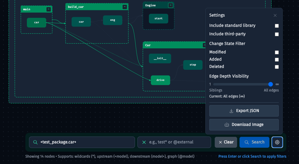
Settings
Click the gear icon to open the settings popover.
Package filters
| Option | Default | Effect |
|---|---|---|
| Include standard library | Off | Show nodes imported from the language’s standard library (e.g. os, sys in Python) |
| Include third-party packages | Off | Show nodes imported from installed third-party packages (e.g. requests, numpy) |
These filters apply on top of any selector query.
Edge depth visibility
A slider from 1 to ∞ that controls how many hops of edges are drawn from the currently visible node set.
| Value | Effect |
|---|---|
| 1 | Only edges between nodes that are directly adjacent (siblings or parent-child) |
| 2–5 | Edges up to N hops away |
| ∞ | All edges between all visible nodes |
Reducing edge depth on large graphs reduces visual clutter.
Edge types
Five toggle buttons — one per edge type — that control which edge categories are visible. Active (shown) types are highlighted in green; inactive types are grayed out. Clicking an active type hides it; clicking an inactive type shows it again.
| Type | Meaning |
|---|---|
| calls | One function calls another |
| is-a | A class inherits from another |
| has-a | A constructor call (one object contains an instance of another) |
| references | A name reference (e.g. accessing a constant or type) |
| imports | A module-level import |
The selection persists across reloads via localStorage.
Export
| Button | Action |
|---|---|
| Export JSON | Downloads the current graph data as a JSON file |
| Download Image | Exports the canvas as a PNG image |
| Copy Mermaid | Copies the visible graph as a Mermaid graph TD diagram to the clipboard. Only visible nodes and edges are included; collapsed subtrees are represented as single nodes. Button label changes to Copied! briefly to confirm. |
Detail Panel
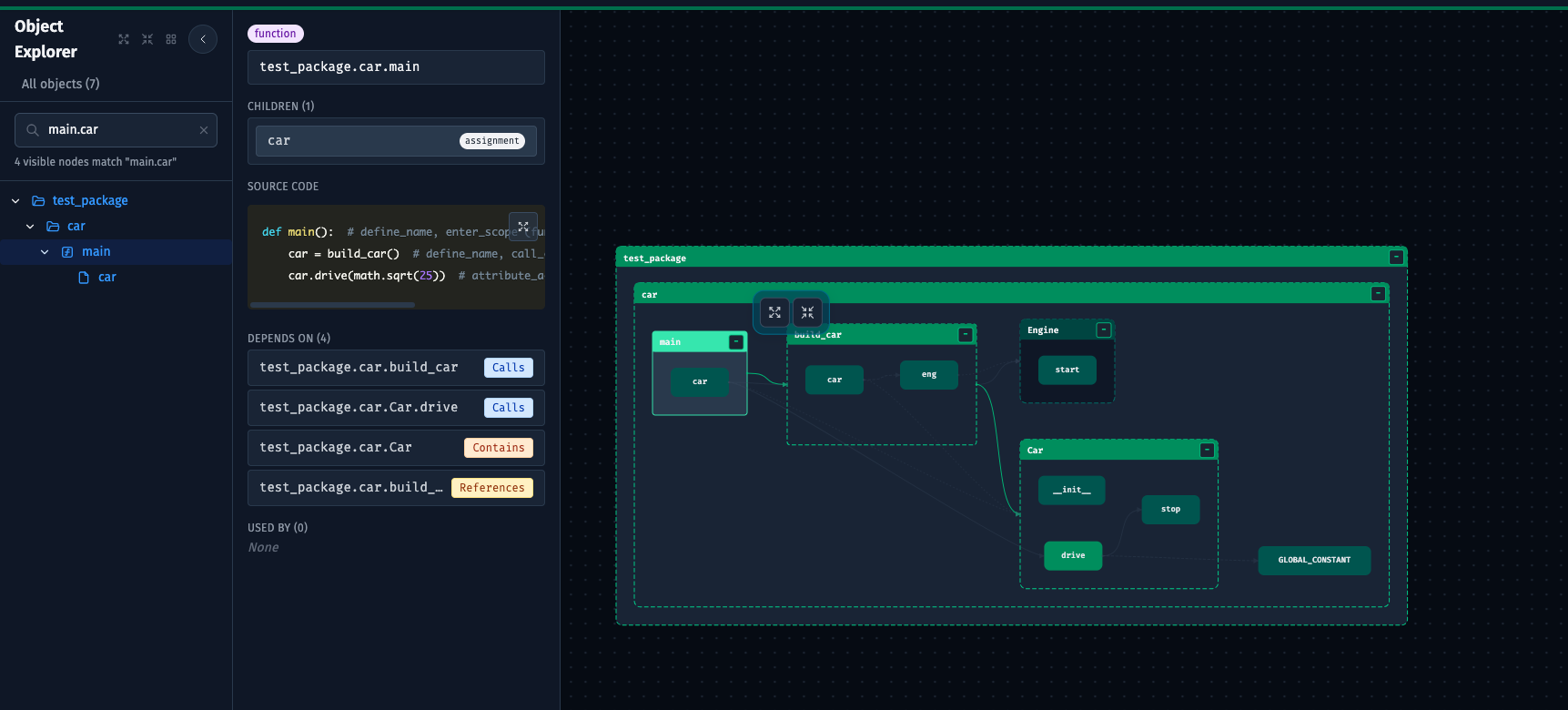
The Detail Panel opens on the right side of the canvas when a node is selected. Click the background to close it.
Resize
Drag the left edge of the panel to any width between 240px and 600px.
Node header
- Type badge — color-coded: blue for module, green for class, purple for function.
- Change status badge — shown when the node is added, modified, or deleted.
- Full node ID — displayed in monospace. The path is right-aligned so the end (the short name) is always visible even if the full ID is long.
Children
If the node has children (e.g. a module with functions, or a class with methods), they are listed in a scrollable panel. Click any child to navigate to it — the canvas pans to it and the Detail Panel updates.
Source location
The line range in the source file (e.g. “Lines 42 – 87”).
Documentation
If the node has a docstring, it is shown in a monospace block.
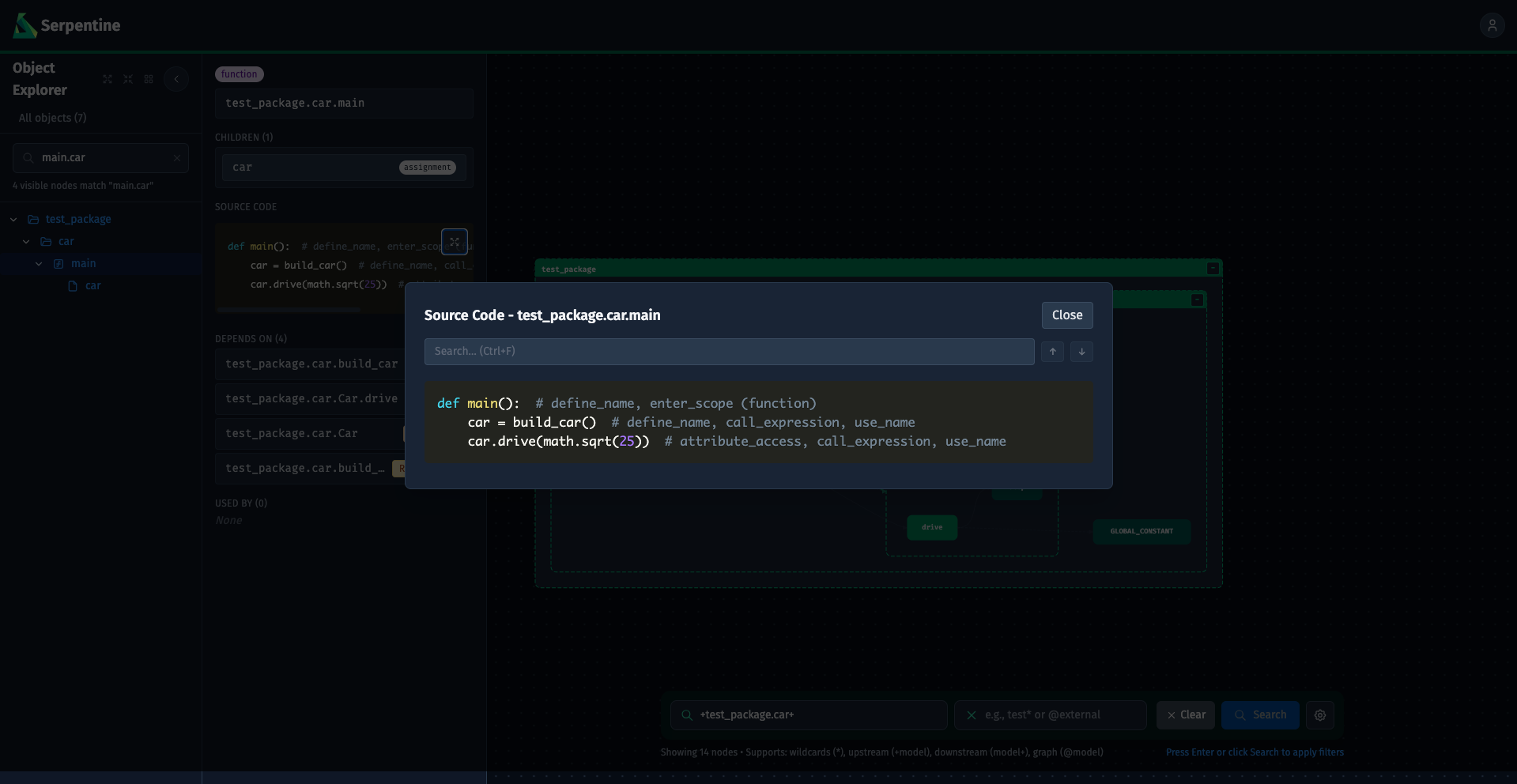
Source code
The node’s source code, syntax-highlighted using Prism. Supports Python, JavaScript, TypeScript, JSX, and TSX. The panel scrolls up to 320px; click the expand button (⤢) in the top-right corner to open the Code Modal.
Code modal
The Code Modal shows the full source in a large overlay. Inside the modal:
- Press
Ctrl+F(or⌘F) to focus the search input. - Type to highlight all matches. The counter shows the current match position (e.g. “3 / 11”).
- Press
Enterto move to the next match,Shift+Enterto move to the previous, or use the↑/↓buttons. - Press
Escapeto clear the search query, or pressEscapeagain (or click Close) to close the modal.
Depends On
Lists every node that the selected node (or any of its descendants) references, filtered to nodes that are currently visible in the graph. The edge type is shown as a badge next to each entry. Click an entry to navigate to that node.
Edge type badges:
| Badge | Meaning |
|---|---|
| Calls | This node calls the target |
| Inherits | This node inherits from the target |
| Contains | This node constructs an instance of the target |
| References | This node references the target by name |
| Imports | This node imports the target |
Used By
Lists every node visible in the graph that references the selected node (or any of its descendants). Same badge system as Depends On. Click an entry to navigate to that node.
Keyboard shortcuts
| Shortcut | Action |
|---|---|
Ctrl+F / ⌘F | Focus the Object Explorer search (when sidebar is open) |
Ctrl+L / ⌘L | Flip graph layout direction (horizontal ↔ vertical) |
Escape | Clear the current search query |
Ctrl+E / ⌘E | (Search bar) Trigger search |
Enter | (Search bar) Apply the current query |
↑ / ↓ | (Autocomplete dropdown) Navigate suggestions |
Ctrl+F / ⌘F | (Code modal) Focus in-modal search |
Enter / Shift+Enter | (Code modal search) Next / previous match |
Escape | (Code modal) Clear search or close modal |